Friday, February 27, 2009

Library Thing is too much fun

If you don't know about Library Thing, and you are currently in library school, then you need to (as I did) get with the program and start it up. Or if you are just nerdy and like books a lot, well, you can come too. It's way too fun for those of us who have slightly compulsive needs to organize (or "catalog") things and, along the way, brag about how well read you are.

I'm not saying everyone feels that particular need. But be honest: you probably do.

Essentially Library Thing is a place to catalog your personal bookshelf by searching for books and adding them into your collection. (See also: Delicious Library) You can search via Amazon or the LOC, or a long list of other search engines. I found the best results for mine on the Amazon search, though I suppose if you were going for a more textbook or rare book collection, a library catalog would be more your speed.

Inevitably, the edition of the book may matter to some, so there is also the option to manually enter books into your library. You can even scan your own cover and attach it to the record. The best part about this feature is that the scanned covers are shared with the community, which enables anyone to select the cover of their choice. I like buying used books, and I find that the old covers for things are often better than the newer post-2000 reprints of books. It also helps to mimic your actual bookshelf at home, if you're into that sort of thing.

As any good Web 2.0 tool does, Library Thing allows you to tag your books, which enters them into the collective consciousness. You can also recommend books to other Library Thing members. I entered "The Loved One" by Evelyn Waugh, and it turns out that MichaelPNaughton has recommended that I read a book called "Deathryde: Rebel without a Corpse." Maybe next time, Mike, but thanks for the offer anyway.

Bottom line: Library Thing is a lot of fun for nerds. I expect that this summer much of my time will be spent adding and "browsing" books. I had a so-so reaction to GoodReads, because I tend not to dig on internet people's recommendations of books, but the ability to make your own bookshelf online? Sign me up.
Continue reading...

Who puts the L in Library?

In response to the recent phenomenon of removing the "L" from many former library school names... I can't say what I think is right. I can understand both sides of the story, I suppose. The pro-L folks say that the library must be validated by retaining the name in the school title. The anti-L folks seem to think that antiquates the skill set learned in an "information school"--it should be broader than just libraries these days.

I tend to agree with that sentiment, though I can't say I am particularly anti-L. I am a pretty techno-savvy person (though I'm pretty sure using the term "techno-savvy" means I am not, or it is 1997). But this doesn't mean just because I could work outside of a library that I will. On the contrary, I went to library school in order to be able to work in a library. Now that I'm here and know more about the training I am getting, I may decide that I can use some "transferable skills" to get out somewhere, maybe work "on the outside," but the idea of being a librarian of some kind is still my and many of my classmates' primary motivator.

I do like the idea that we in library school gain a broader knowledge base than that required to do collection development. And removing the "L" certainly does position a school on that side of the line, but to me it just seems like marketing. If removing the L is what it takes to get and retain quality faculty with an interest in applying technology and information organization to a more traditional library curriculum, then by all means take it out. Faculty retention is a big issue, and library schools have to fight to stay competitive in that way.

Rutgers has cited the need to stay "competitive" as part of the reason for axing the L--and if that is what the powers that be consider to be more marketable, then, I personally don't see the big problem. Maybe now we can all be web designers, OK, but the traditional library model is not going away. Library schools in Michigan and Washington (and Texas and Toronto) continue to produce successful librarians, without an L in sight. Perhaps broadening (and modernizing?) the image of library schools will be the shot in the arm that is necessary.

Perhaps what it comes down to is that the concept of the library is still caught in the transition from card catalogs and sepia-tone women in pencil skirts into a picture that is in 16 million colors and has patrons sliding their books across an RFID scanner to check them out. What I am saying here is that I believe library studies should be now be focused on increasing technological literacy in faculty and students, and that the shared conception of the library has to shift before the marketers controlling university programs worldwide will accept it as forward-looking. "Information" is sexy now, the "library" is not.

As soon as a common, shared image of the modern library exists, then the L will not be considered a detriment to competitiveness. But until that time, if the L word continues to carry a stigma, then maybe it is time to change.
Continue reading...

Thursday, February 26, 2009

delicious v. furl

I've been using Delicious for a couple months now, ever since I needed a good way of keeping track of articles that I was researching for the precursor to the paper I discussed below. I had been using my Firefox bookmarks, but every time I didn't have my laptop on me I kicked myself for not having them online anywhere.

At first I tried both Delicious and the now-defunct(?) Magnolia, looking for a way to bookmark online that mimicked the folder structure of Windows Explorer, Finder, or even the Firefox bookmarking tool. Because I, and everyone ever, is used to organizing files into folders, I really wanted a system that would allow me to organize that way.

I understand, of course, that by tagging (the dominant mode of social bookmarking's organization) you can achieve the same effect of a folder, as long as you are consistent with applying the same tag to each bookmark that you want to keep together. It just takes a little getting used to not seeing actual tiny folder icons that you click on to open up a list of related files. You (or I do anyway) have to remember that online bookmarking is about more than personal organization--it also enables you to share that information when the time comes, and see what other people have tagged. Personal "folder" organization looks inward and hides your files within. Tagging looks outward, organizing your files in a way that is larger than just you.

What ended up selling me on Delicious was their high-powered Firefox extension. It completely takes over for the bookmarking tool in Firefox, shuffling all your existing bookmarks online, and overwriting the keyboard shortcut (Ctrl- or Cmd-D). Additionally, you can manage your "favorite" tags to appear in an expandable toolbar. This means that you can get rid of your Firefox "Bookmarks Toolbar" in favor of Delicious's toolbar. You don't lose any functionality as long as you take the time to set it up, and you don't lose any browsing area to yet another extension. Thank god I didn't choose ma.gnolia.

And, so, I happily converted to all online bookmarking, said goodbye to my wish for online folders and went on my way. Until, for this course, I looked at Furl and found that they have those darn folders! Well not exactly, but it's closer than Delicious.

I'm not about to switch now, I'm in too deep. But it was sort of what I was looking for a while ago. They allow you to not only tag your bookmarks but assign them a more general "topic," which they adorn with a picture of a little folder. Your bookmarks still display in a long list, but it's one step closer to a real folder than Delicious or Ma.gnolia had.

That said, I found Furl's interface to be a bit unwieldy... they use a lot of vocabulary that is unfamiliar in a social software context: "keywords" (instead of tags) "topics" (instead of folders) "clipping" (???). They enable a lot of good collaboration just like Delicious, but there's just too much going on at once for me. Also, those ads above my bookmarks are just obnoxious. It is a nice alternative for those looking for a service that isn't owned by Yahoo! But until they come out with a full-service Firefox plugin, I just can't consider it.
Continue reading...

Wednesday, February 18, 2009

New: twistori

There's not much to say about twistori, except that it is a wonderful use of the Twitter developer API. They import tweets from different Twitter Searches, and have a scrolling list of the tweets that come up.

The searches are sort of primal emotions: love, hate, wish, believe. This makes a rather intriguing list of tweets, all of which contain the chosen phrase. Reading many of them in a row interrupts your expectation of what you think people may be wishing for or believing in.

It is a little frustrating as the list moves quickly, and there is no way to scroll. It is a self-described experiment, and for what it is, it does it well. Really it's just for fun at this point, but the creators say it is the "first stage of an ongoing social experiment." I wonder what the experiment could be? Defining a more fleeting notion of love and hate? An attempt to expose the folly of the tweeter who writes "I love wendys even though it clogs my arteries"?

Perhaps we will never know, but that doesn't mean we can't sit back and enjoy the ride. There's even a screensaver for Mac OS X.
Continue reading...

Tuesday, February 17, 2009

Information (over)load

The question: Do RSS and XML feeds worsen or help with the woozy side-effects of information overload?

Answer: I think it helps, but I am sympathetic to those that disagree.

I remember having a conversation about two years ago with a friend who was saying he liked the experience of actually navigating to the blogs that he liked to read and finding new posts, as opposed to using a feed reader. Part of the reason why he liked reading blogs was that each one presented itself in a different manner (see my post below for more on that particular issue) and that visiting each one to find the content was all part of why he read blogs in the first place.

Sometimes I wonder if he still sticks to this fundamentalist strategy, but I mostly figure that it simply cannot be true anymore. There is simply too much. He went on to be an editor somewhere, and I believe is now a writer, and that just can't be practical any longer.

Does this mean that all is lost, and we are slowly developing tunnel vision, peering at the information through our Google Reader "All Items (1000+)" page? Certainly not everyone, but often I fantasize of paring my list of 50 blogs down to a more manageable 10, eliminating those pesky Boing Boings and Gizmodos for something that posts a more reasonable 1-2 times a day. But what will I miss? What will I mention is funny and interesting at class tomorrow if I have eliminated Gawker from my reader? There they sit, 20 or 30 posts each day, racking up pale white lines of unread posts that stay unread, while I remain subscribed, mired in my own indecision.

And yet, without the option to embed information streams in such a reader, or on a web page, or on this blog, the Internet as we know it would provide so much less utility, fun, excitment and efficiency. So much of the exciting developments of the Web in the past 5 years has centered around the ease with which people can share information, instead of just finding it. This, I believe, helps ease the burden of information overload. The ability to quickly see and evaluate information that is shared or syndicated by others provides such a boon to those who want to find it. Before, we may have known something was out there, but we would be at the mercy of the entire sprawl of the World Wide Web. At least with a feed reader full of 50 blogs, I know that what I want is inside; now I just have that list to grapple with.
Continue reading...

Tuesday, February 10, 2009

Aesthetic passion

OK it's not that I am what you may call "passionate" about this topic, but I have been embroiled in a research paper over the past couple of weeks with a friend of mine here at UBC. I find it quite interesting, and have written on it before, so I thought for our "free-for-all" post this week, I would share a little bit about what we have been up to here in Vancouver.

Essentially what we are doing is writing a literature review for a study that we are never going to complete. All grads at SLAIS have to complete a course in social research methods (yee haw, I know) and our term project is a literature review and research design for a "study" which we won't do (because of time constraints, and the small fact that really this should be a thesis). The saving grace is that you can work with a partner. This may be a curse depending on who you know. I got lucky.

What we are studying is the visual aesthetic elements of blogs and how they affect users' perception of the "purpose" of the blog. This entails researching not only the effects of aesthetic design elements on user perception, but also how those perceptions are influenced by the context of the interaction (i.e. reading a blog). Aesthetic elements of interface design are something I find very interesting, and was surprised to find that until fairly recently, around the year 2000, the study of interface design in the field of Human-Computer Interaction (HCI) had not included many subjective elements like aesthetics, and was instead focused mainly on the more objective design, such as usability (i.e. efficiency, measurable ease-of-use, etc.).

The other aspect of our research is a bit more related to this class, in that we have had to investigate a proper definition of blogs as a "genre" on the Web. Aside from that, we will endeavor to break that genre down into visual parts: a blogroll here, a heading there. This is really the forte of my partner, but it has been very interesting to try and classify such a broad area of the Web--blogs--into a single, visual entity. This is going to be a challenge moving forward as we set out to design a study that tackles these issues.

I find this topic particularly intriguing because I have always been interested in art and artists; that personal interest translates professionally into the world of visual information design and interaction. Likewise, I have an interest in the Web, and how people use it to accomplish so many varied tasks. Understanding what dictates someone's perception of a certain blog is a very tricky thing to figure out, but we are hoping it comes down to visual design.

If you're still reading, do you have any insights for us as we move forward in this endeavor? Can you identify what visually separates a personal blog different than a news blog? How about a Canadian blog from one based in Dubai? (All of those were weblog award winners, if you're curious.) If anyone is super motivated, I can point you to about 8 million articles on the topic, most of which will be available through your local library database collection.
Continue reading...

Good Reads

As I was stumbling through a big list of social media and web 2.0 sites today, I came across Good Reads. I had heard my friend here at school mention this once before (she had previously completed a degree in Children's Literature, so you can imagine, she likes to read) but I'd never checked it out before.

Essentially Good Reads is like a social networking site, but with just a dash of Amazon.com thrown in. It runs on reviews: you tell Good Reads what you've been reading lately, provide a rating and a review, and then it broadcasts your information across the network. You can have friends, whose recent activities (reviews, books they claim they're reading, books they have marked as "favorites) you will see when you log in. You can search for reviews of books that you want to read (to get a sense of if it's worth it) or of books you love (so you can scoff at and insult those who have given it a bad review).

I find that with social software tools I feel a little spread out if I have to sign up for a new one. I like to integrate them as much as possible... or at least make it so I don't have to a visit yet another web page when I start up my browser. I run Twitterific in the background all day and import my Delicious bookmarks into Firefox's menubar. Good Reads, it turns out, you can import into your facebook account (if you have one), and you can access and edit your life there all through the facebook interface, which is nice. I tried it out, and found a couple friends already using it (turns out a friend from high school likes The Great Gatsby.)

I was an English lit major in college, so I tend not to rely on online reviews when selecting my next book. I also tend to go to used book stores instead of ordering them. In spite of the greyish yellow color scheme of the site, Good Reads will never smell delightfully musty like Bridgid's Books. That being said, I am still intrigued because if I had an active community of friends on Good Reads, I wouldn't argue with participating. I, like any other person who likes reading, like talking about the books I read and enjoy bullying people into liking what I like. Then again, being a librarian, perhaps I would rather be a part of Library Thing...
Continue reading...

Monday, February 9, 2009

bloglines v google reader

I am not going to pretend neutrality on this issue. I started reading feeds a few years ago to get through the workday in a library office without windows. My first feed reader was a desktop client (had to download and install it) called BottomFeeder. My supervisor used Bloglines so I set it up, too, but quickly found it too clunky to use. Then I found Google Reader and my life hasn't been the same since.
  • Google Reader has collapsible windows for each post. This makes it easy to see what you have and have not read, and what you are reading and what you are not reading.
  • Bloglines does not have this.
  • Google Reader has a clean interface. Bloglines does not have this.
eek
  • When I subscribed to Boing Boing in Bloglines, it said I had 200 unread posts. After clicking on it once, they were all marked as read! When I came back, nothing appeared.
  • A positive thing: the "playlist" function, where you can customize groups of feeds to read together, is something that, to my knowledge, you can't do in Google. If you organize by folders, however, it is easy to achieve this effect.
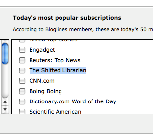
Anyway, I suppose it's always good to have options. It also seems as though there are many librarians on Bloglines: a techie librarian blog, the Shifted Librarian, was listed as one of the 50 most popular!

Regardless, I won't be switching back anytime soon.
Continue reading...

Friday, February 6, 2009

Duke University's "Library Hacks"

Found this blog on the Blogging Libraries Wiki: Duke University's Library Hacks. Basically this is a blog dedicated to hints and tips about library use, and productivity in general. From their about page:

Library Hacks is a place to find out about tools, resources, services, and ideas that can help make your research and the library more efficient for you. It’s written mostly by Duke Libraries staff, but we’ll also have occasional student and faculty guest bloggers. (Want to be one? Let us know!)

Our inspirations are blogs like LifeHacker, LifeHack, AcademHack, and ParentHacks, and book series like O’Reilly’s Hacks Series.

I think this is a great way to draw in users that may not already be a part of the library's normal audience. I am a believer in "bridging" the gap between non-users and the library using social software because of its low commitment level. The readers of this blog may already know about the library. But, they may have simply done a search on audiobooks, or multiple-computer productivity, and found that there is someone at the library writing about how to deal those sorts of problems.

And it may stop there. Read the post, move on. But some may read it, see that it is from the library and then come back for more information, or look at some of the other library resources that are linked to on the blog's home page.

The problem with this model is that this is most likely not going to be the first blog a library produces. That may need to be modeled more around news and library programming. In that instance, however, posts along these lines could be sprinkled in, just to add a little spice to the normal fodder.
Continue reading...

Wednesday, February 4, 2009

blogger v wordpress

It seems to me that commercial blog software these days is pretty standard. Some features you get on both Blogger and Wordpress.com:
  • Templates for blog layout
  • Widgets or gadgets to display archives, blogroll, rss, etc.
  • Certain level of control as to commenting, trackBacks
  • Either WYSIWYG (What-you-see-is-what-you-get) editor or HTML.
The first ever blog I wrote was on Blogger. It chronicles the road trip that I took while driving from Minnesota to British Columbia. We did this in the car, connecting to the internet via a cell phone. I did the posts quickly, and didn't fuss with many settings and found it very easy to use.

The second blog I wrote was on WordPress.com, which I found at first somewhat unsettlingly complicated. This blog was written on how libraries are using Flickr to enhance their collections, and was done for a class last term. This meant it was to my advantage to tweak the settings and make everything look as nice as possible. I found that once I got used to the more advanced "dashboard" that things were very customizable.

After just looking back over my accounts I've identified a few differences:
  • There are many, many more templates to choose from on WordPress.
  • However, you cannot edit the HTML/CSS of your template for free like you can on Blogger. This is so cool and something I really wanted to be able to do last semester.
  • WordPress.com blogs allow "Pages"--a separate area for information like, About the Author, or Additional Resources. Nice for separating that information from the side columns on your main page.
  • WordPress.com settings take a long time to save, and it takes a while to move between pages in your dashboard. This may be due to the site traffic, who knows, but it's annoying.
  • Blogger makes it hard to have an abbreviated post on the main page. This is when you see a little "More..." link on the main list of posts. I think those are nice, and keeps many posts visible at one time on the home page. In WordPress you can insert this by clicking a button. In Blogger you need to edit the HTML of your post with specific code found on a help page somewhere.
As for data portability, it is hard to say. Can you get your data elsewhere after you have put in so much work? WordPress imported my old Blogger blog just fine, and I didn't even have to export it first, it was all done automatically through the web.

However, Blogger couldn't import my WordPress blog, to my dismay. It apparently only supports importing from other Blogger blogs. I'm not sure if that is the fault of the WordPress export file (i.e. they export in a proprietary XML format), or if Blogger simply hasn't written the software that can do the import. Either way, it seems once you are on WordPress it may be hard to get off.

This may not be an issue, however, because WordPress.com also supports a stand-alone server version of its software called WordPress.org. This is fairly robust, I think, and if you have the know-how and staff for it, could be a good option. There is an active community of WordPress users, as well, so tech support is probably often free. Perhaps you would never want to leave.

I think, overall, Blogger is the way to go for ease of use (and that CSS template editing). And, if it turns out I'm wrong, I can always get my data out. The page loading time issue on WordPress is enough for me to stay away, unless I was going to be running my own server.
Continue reading...